The solution we offered
Labeling and packaging matters a lot because, quite often, it is an eye-catching label and the lustre and the design of the package that attracts a customer to a product. Moreover, the label should be unique in quality and must capture the interests and preferences of potential buyers.
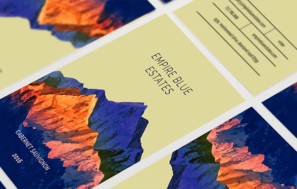
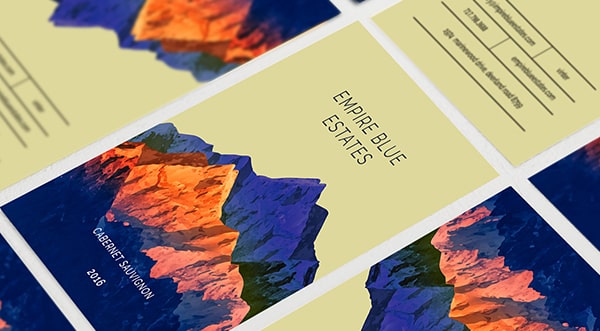
Every wine has a story to tell, and it is our job to bring this wonderful story to life. This has to be done by interpreting and communicating it visually, in the most convincing and engaging manner, and that too on a rather tiny canvas. So, it’s all about effectively condensing the visual concept, graphic clues, and treatment of the name.
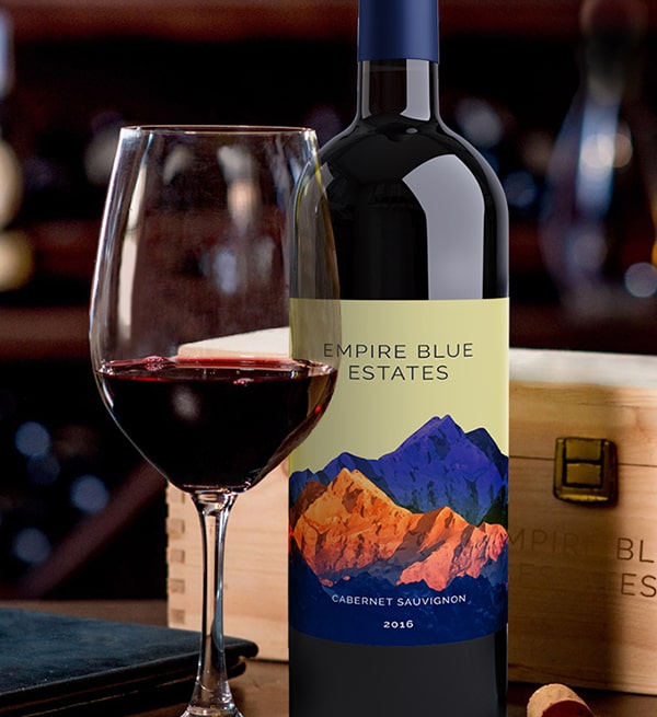
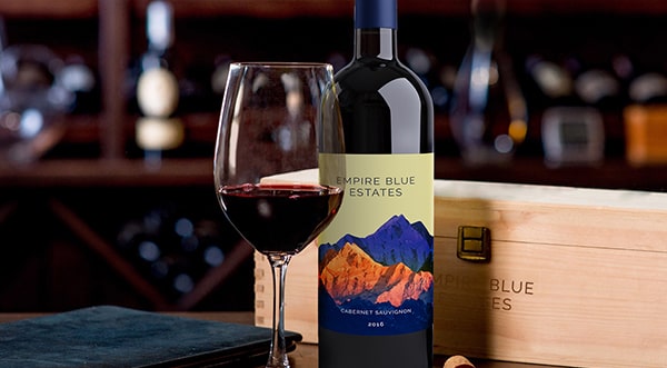
Art inspired by Nature
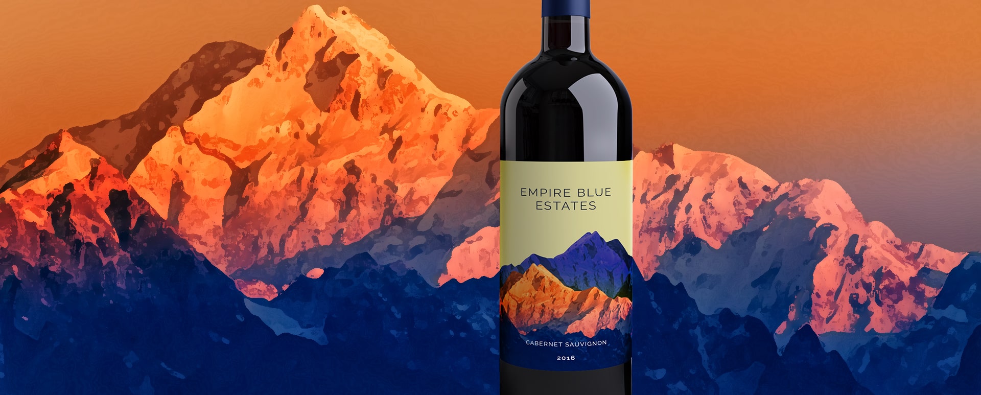
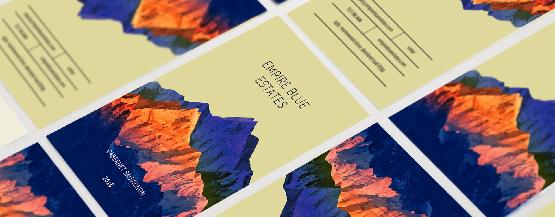
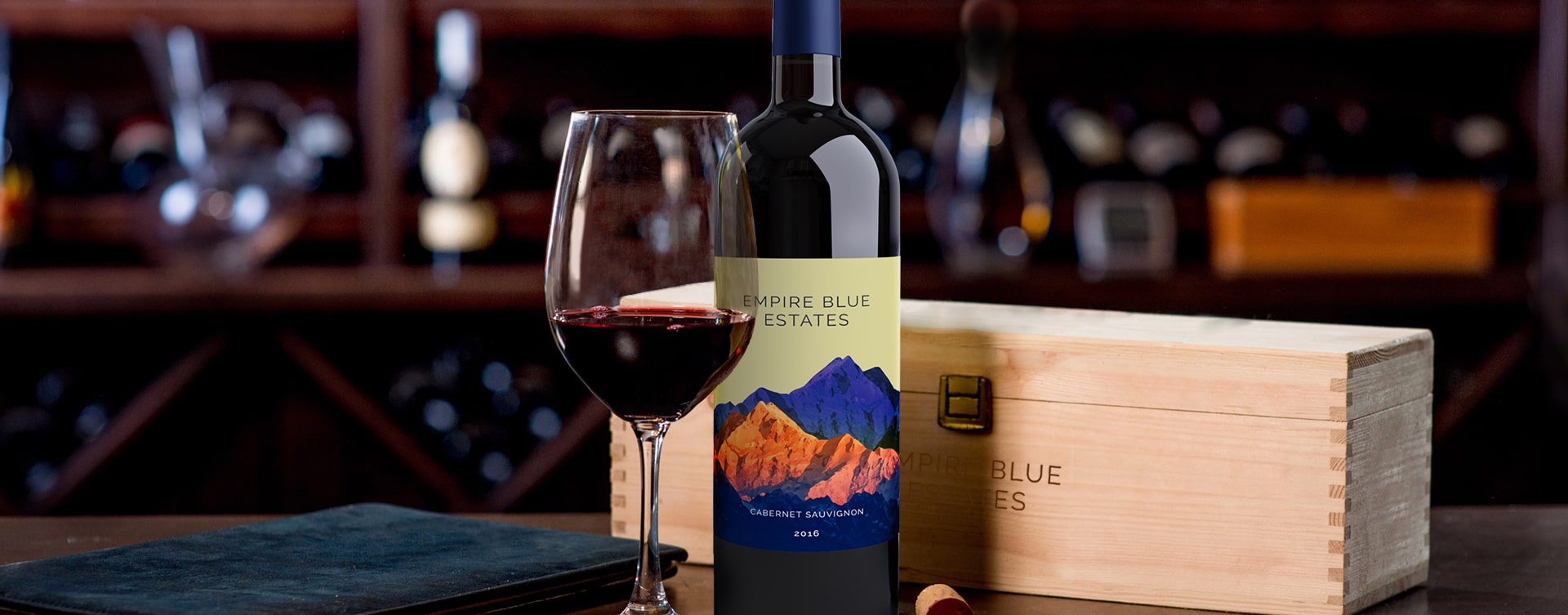
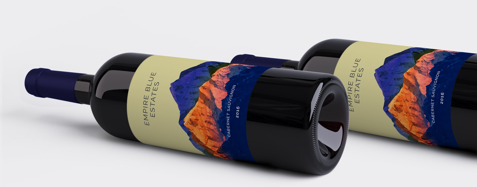
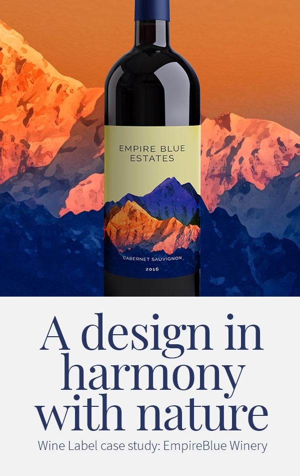
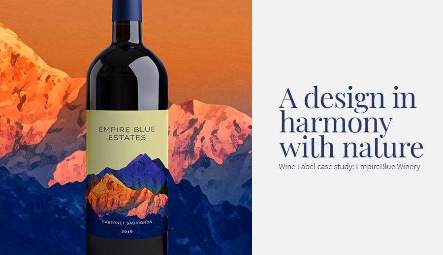
This label has drawn inspiration from nature. Mountains and sailing - the predominant elements used in the design – establishes the connection between Man and Nature. While the Blue and Orange mountains represent nature’s benign charm, ambition and the desire to scale greater heights, sailing symbolizes freedom, new beginnings and the quest for life-changing experiences. Art, the spirit that unites both the elements, is depicted by an unfurled sail that opens up between the mountains. The label, designed by our creative team at TRIXMEDIA, is a composition on several levels that captures the intricate shades of nature through art.
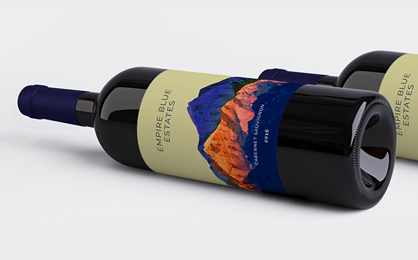
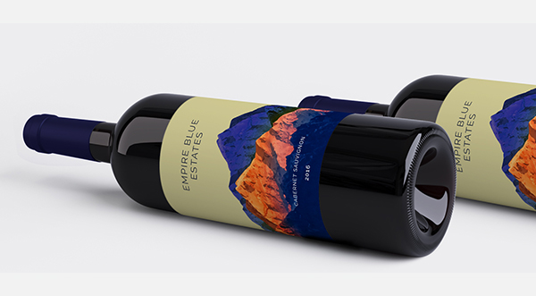
Results
The market reaction for the brand redesign was incredibly positive. Within a few months of release, the distributor added the wine to all its top-tier stores nationwide. Production tripled in two years and Slingshot was able to expand distribution to retailers like Whole Foods and Total Wine.
“TRIXMEDIA is simply the best at what they do. they didn't just create a label for the brand; they helped us communicate what we stand for.”
- Ray,
Founder, HILTON

6835

